0 Comments
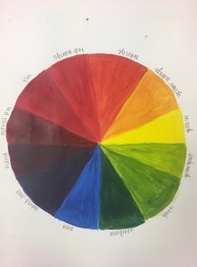 This is a color wheel painted with acrylic paint. This assignment was done to practice the mixing of colors to create new ones. We were assigned to include all primaries, secondaries, and tertiary colors in our wheel. 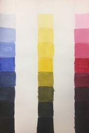 This is a value chart using the primary colors in acrylic paint. Each strip of colors were completed by adding black to the base primary color in small amounts to create a darker value until it reached black. The opposite was done (adding the base primary color to white) until the white reached the base primary color.
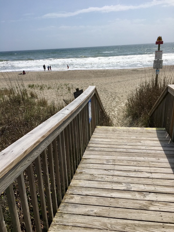
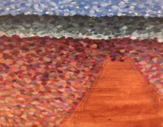
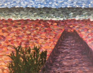
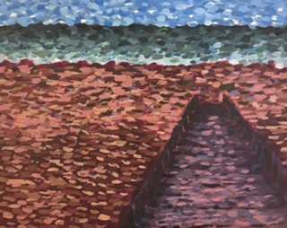
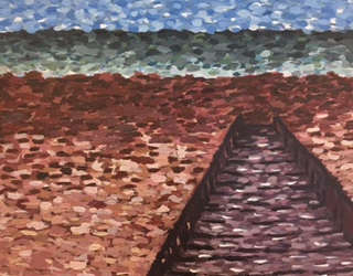
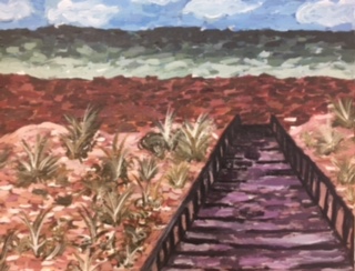
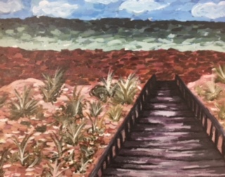
For this project we were assigned an artist and were required to recreate a landscape of our choice in their style. My artist was Claude Monet, a french painter. His style was very focused on the lights and darks of everyday scenery, like the pond in his backyard. His paintings were done with very small, light strokes. he used a lot of white in his paintings to push the highlights of his pieces. For this project, I took a very basic picture of a boardwalk leading to a beach and recreated it using his style. I used his impressionist style of small brush strokes and pushing the values and am very happy with how it tured out. The most difficult part of this project was figuring out how to create the plants, and also getting the values of the bridge correct. Monet also used a lot of bright colors in his pieces, so I tried to incoorperate that into the sand and the bridge. If Monet could see this painting I don't think he would recognize it as his style unless someone told him, but given the fact that this was my first attempt it wouldn't be a total insult to him. If I had to do the painting again I think I would change the bridge somehow. I am not a huge fan of how the perspective of it turned out. I also feel like I could deepen the darker values to really push those more. 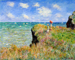 This is just an example of a Monet painting to get an idea of his style. I used this picture a lot to figure out how to place my highlights and how to create his "blurry" effect.
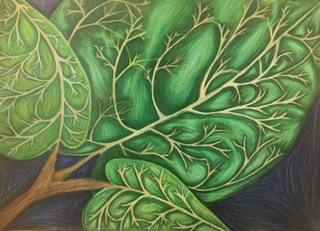 This projet was inspired by the work of Georgia O'Keeffe. She is known for her up close images and the way she blends colors. I used a full range of values to crate the illusion of depth on the leaves. I think I executed this fairly well, and am happy with the result. Because the leaves were drawn up close and in detail, I think this represents Georgia O'Keeffe. I used a variety of greens and yellows throughout this piece to create value along with a realistic looking aspect to the drawing. I created contrast by keeping the stem part of the leaf light while surrounding the stems with a layer of dark to make them stand out. I also created contrast with the shadows and highlights throughout the piece. I placed the highlights in the middle of the sections I created in between stems, and the shadows were placed around the stems. I had an issue blending the colors after I had put so much colored pencil down, which is why certain parts look dull and/or streaky, so if I could improve one thing it would be how I layered the colors. Overall, I am very happy with how this piece turned out. Pictured below are the steps I took to reach the final result. In the first two photos are my composition sketches and color swatches. The third photo was my reference photo, which was a picture I took of one of the plants at my house. The fourth picture was an attempt at layering the white of the stems onto the green of the leaves without dulling them. I also used this to test the color intensity on the black of the paper. My final sketch is pictured in the fifth photo where I was planning the layering of the prismas and the tone of the stems. The last two photos were taken of my final before it was completed. In this unit we learned how to use colored pencils to create value and texture in forms. In the slideshow below, the last picture shows my first attempts at using prisma colored pencils in spheres and the fourth picture shows my first attempt at adding value to a form, in this case it was a pear. Our mini project was to draw a still life on three different backgrounds to test how the prismas worked on different background colors. In my first attempt, I drew the gourd by itself on a brown background (picture 2), as my second attempt I drew the pear on the grey background (picture 3), and my third attempt was both of them together drawn on a black background (picture 1). Overall, my favorite look was the black background because it made the color pop the most. We spent this week learning tehniques with water color paint. These techniques are useful in creating value and detail in pieces. We used these techniques in four still life paintings of apples, which can be seen in the slideshow below. The first apple was monochromatic, which was designed to help us create value using only one color. The second apple was created using watercolor pencils, which allowed for more precision. I layered prismas on top to add another layer of value. The third apple incorporated multiple techniques for added texture. I used the wet on wet along with salt (a sample of both can be seen in the first and second pictures in the slideshow) and I also layered prisma on top of this one too to create more value and texture. The final apple was a free for all so i decided on doing it in dry brush and then adding pen for added value. I didn't like how the pen turned out, but the apple itself was pretty cool looking. 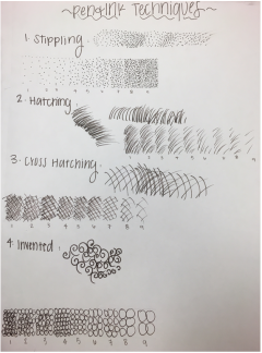 This week we learned how to create value using pen and ink techniques. These included stippling, hatching, cross-hatching and invented. 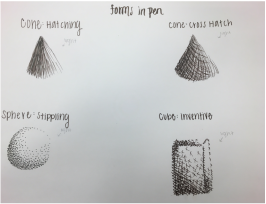 Here are four different forms done in different types of pen and ink techniques. 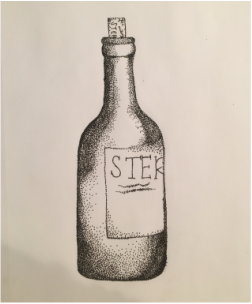 This was a mini project that took about two or three days to practice our pen and ink technique. I used stippling for the bottle.
SketchesThese are a few sketches from my sunflower perspective pen and ink project. The sketches in pencil were to figure out the placement of flowers on the page, and on the side I was testing different petal shapes. In the other photo is a final sketch of the placement of flowers where I practiced stippling a few pieces to test the values. 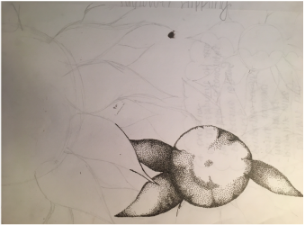 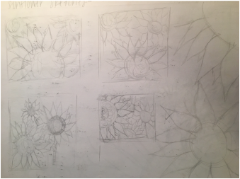 FinalI ended up choosing to stipple a bunch of sunflowers because out of the four techniques we practiced, stippling was the one that I found most intriguing. I chose the sunflower idea because I thought the value in the petals would be interesting to work with and I also knew I could work a lot of perspective into it. I used perspective in the placement of the sunflowers. The large half flower is the focus point, but the background has smaller flowers to incorporate proper perspective. There is a lot of texture in this piece due to the stippling of the entire thing. This creates value and perspective as well. Without value, there would be no depth to the piece. Going into this project I did not expect it to take as long as it did. I spent about two weeks working on this project using a .01 brown micron pen and some 9x12 cream colored drawing paper. Each area of each flower had to be carefully executed in order to create value and perspective in the piece. I feel like it could be executed much better by someone with more experience in stippling, but for a first try I think I did a decent job. If I could redo this piece I would start with the large half flower and work my way down in size. My value was very dark for the second largest flower (bottom right) and I am not a huge fan on how the center of that flower blended out. In order to create a realistic looking piece you need to have a really clear idea of what each section will look like before you try to start. 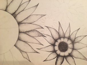 |
AuthorWrite something about yourself. No need to be fancy, just an overview. Archives
January 2017
Categories |
 RSS Feed
