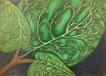
 This projet was inspired by the work of Georgia O'Keeffe. She is known for her up close images and the way she blends colors. I used a full range of values to crate the illusion of depth on the leaves. I think I executed this fairly well, and am happy with the result. Because the leaves were drawn up close and in detail, I think this represents Georgia O'Keeffe. I used a variety of greens and yellows throughout this piece to create value along with a realistic looking aspect to the drawing. I created contrast by keeping the stem part of the leaf light while surrounding the stems with a layer of dark to make them stand out. I also created contrast with the shadows and highlights throughout the piece. I placed the highlights in the middle of the sections I created in between stems, and the shadows were placed around the stems. I had an issue blending the colors after I had put so much colored pencil down, which is why certain parts look dull and/or streaky, so if I could improve one thing it would be how I layered the colors. Overall, I am very happy with how this piece turned out. Pictured below are the steps I took to reach the final result. In the first two photos are my composition sketches and color swatches. The third photo was my reference photo, which was a picture I took of one of the plants at my house. The fourth picture was an attempt at layering the white of the stems onto the green of the leaves without dulling them. I also used this to test the color intensity on the black of the paper. My final sketch is pictured in the fifth photo where I was planning the layering of the prismas and the tone of the stems. The last two photos were taken of my final before it was completed.
0 Comments
Leave a Reply. |
AuthorWrite something about yourself. No need to be fancy, just an overview. Archives
January 2017
Categories |
 RSS Feed
