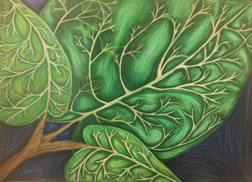
 This projet was inspired by the work of Georgia O'Keeffe. She is known for her up close images and the way she blends colors. I used a full range of values to crate the illusion of depth on the leaves. I think I executed this fairly well, and am happy with the result. Because the leaves were drawn up close and in detail, I think this represents Georgia O'Keeffe. I used a variety of greens and yellows throughout this piece to create value along with a realistic looking aspect to the drawing. I created contrast by keeping the stem part of the leaf light while surrounding the stems with a layer of dark to make them stand out. I also created contrast with the shadows and highlights throughout the piece. I placed the highlights in the middle of the sections I created in between stems, and the shadows were placed around the stems. I had an issue blending the colors after I had put so much colored pencil down, which is why certain parts look dull and/or streaky, so if I could improve one thing it would be how I layered the colors. Overall, I am very happy with how this piece turned out. Pictured below are the steps I took to reach the final result. In the first two photos are my composition sketches and color swatches. The third photo was my reference photo, which was a picture I took of one of the plants at my house. The fourth picture was an attempt at layering the white of the stems onto the green of the leaves without dulling them. I also used this to test the color intensity on the black of the paper. My final sketch is pictured in the fifth photo where I was planning the layering of the prismas and the tone of the stems. The last two photos were taken of my final before it was completed.
0 Comments
In this unit we learned how to use colored pencils to create value and texture in forms. In the slideshow below, the last picture shows my first attempts at using prisma colored pencils in spheres and the fourth picture shows my first attempt at adding value to a form, in this case it was a pear. Our mini project was to draw a still life on three different backgrounds to test how the prismas worked on different background colors. In my first attempt, I drew the gourd by itself on a brown background (picture 2), as my second attempt I drew the pear on the grey background (picture 3), and my third attempt was both of them together drawn on a black background (picture 1). Overall, my favorite look was the black background because it made the color pop the most. We spent this week learning tehniques with water color paint. These techniques are useful in creating value and detail in pieces. We used these techniques in four still life paintings of apples, which can be seen in the slideshow below. The first apple was monochromatic, which was designed to help us create value using only one color. The second apple was created using watercolor pencils, which allowed for more precision. I layered prismas on top to add another layer of value. The third apple incorporated multiple techniques for added texture. I used the wet on wet along with salt (a sample of both can be seen in the first and second pictures in the slideshow) and I also layered prisma on top of this one too to create more value and texture. The final apple was a free for all so i decided on doing it in dry brush and then adding pen for added value. I didn't like how the pen turned out, but the apple itself was pretty cool looking. |
AuthorWrite something about yourself. No need to be fancy, just an overview. Archives
January 2017
Categories |
 RSS Feed
